
Color and texture overlays are a way to frame portraits and candid photography. Play with layering lighter hues and texture to allude to the environment, grit and sweat of New Orleans.

Directions
When using overlays, use Multiply in the effects palette to blend colors together and over imagery. You can also adjust the color of the texture. You can find textures similar to these at stock photo houses like iStock by searching “stone textures”.
Restrictions
Use the elements above as a starting point as an inspiration in your designs, but limit the amount you use per page. Below are two examples of what not to do.
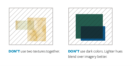
DON'T use two textures together. DON'T use dark colors. Lighter hues blend over imagery better.
