When selecting colors from the palette for layouts and materials, reference the palettes shown here as a starting point. Think of your audience when using color. For example, use bolder palettes when addressing a younger audience, and more sophisticated palettes when addressing alumni and donors.
Tips and tricks:
How to use our color palette
• Lead with the neutral palette.
Allow the core palette to support these hues.
• Similar hues should be used together.
To create visual interest, add accents of an opposite hue.
• Choose a few colors for a smaller piece, rather than
using the entire palette.
• Larger pieces can lean on different color combinations
for different spreads.
• Don’t forget about the importance of white space.
Large fields of white keep layouts fresh.
Bold
Casual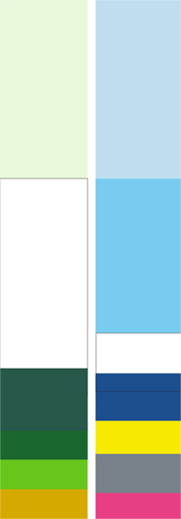
Sophisticated