
The Tulane visual language is composed of a diverse set of elements. When they’re used consistently and combined carefully, they create a sense of continuity throughout all our materials. Do not use all the elements in a single design. Less is more.
Obtaining graphic elements
To maintain visual consistency across all university materials, it’s important to use only the approved brand elements. To access our library of graphic elements, please contact the Office of Creative Services at creative@tulane.edu.
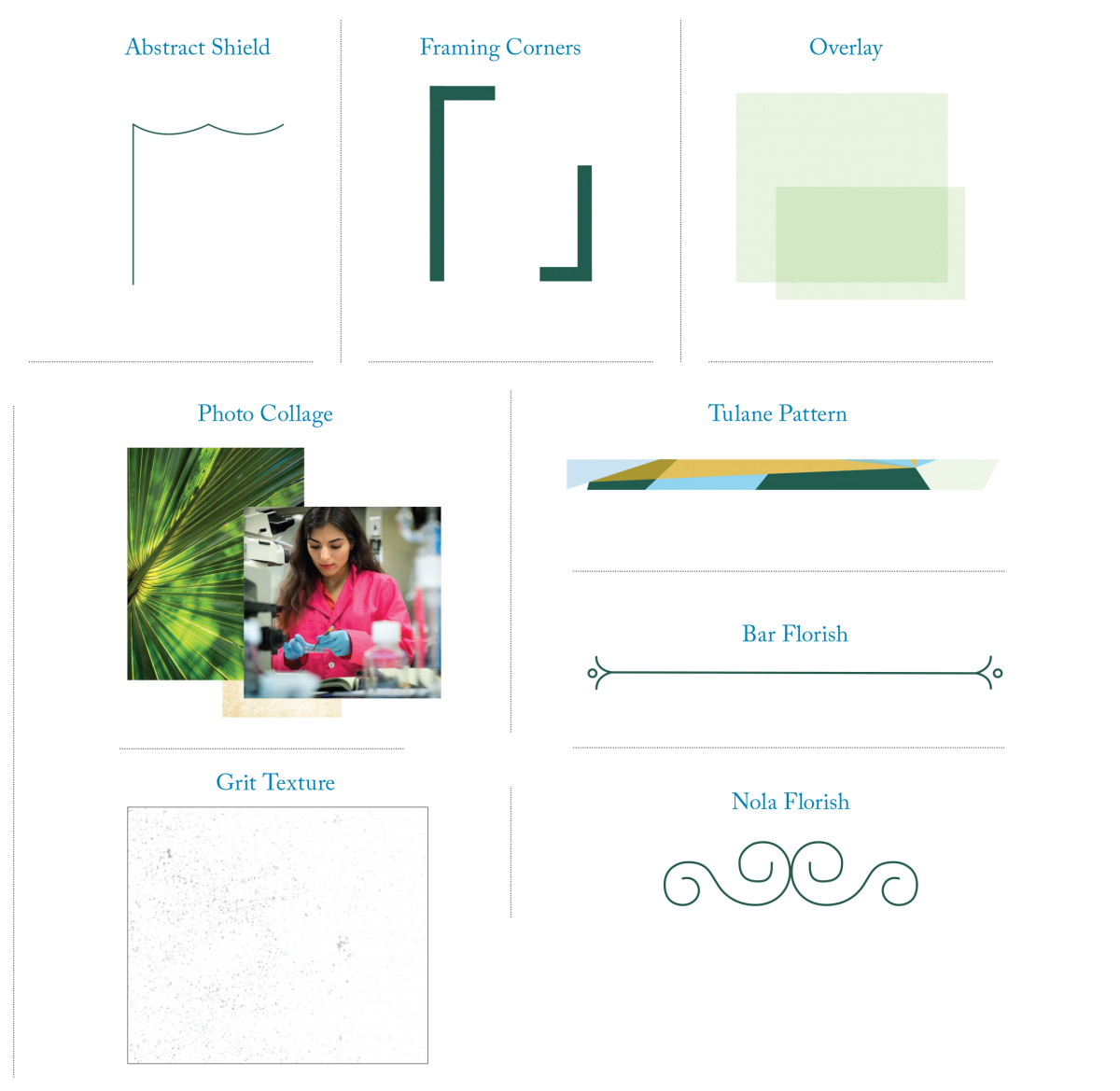
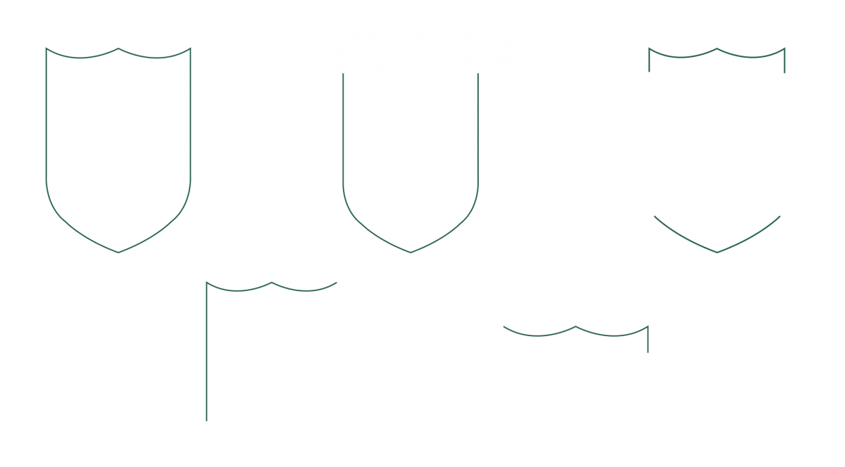
Shield Abstraction
This delicate line work is drawn from the shape of the shield in the university’s logo. These abstractions, in full or broken up, are used to contain or emphasize headlines, as directional elements, or as subtle background components.
Restrictions
Contact creative@tulane.edu to obtain these elements. Do not create new elements. Do not combine with other graphic elements. Use the abstractions above as a starting point in your designs, but limit the amount you use per page. Below are two examples of what not to do.
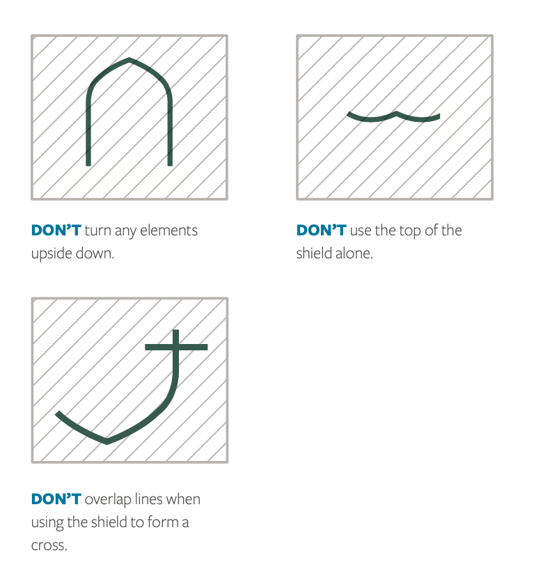
DON'T turn any elements upside down. DON'T use the top of the shield alone. DON'T overlap lines when using the shield to form a cross.
Framing Corners
Created from right angles with a heavy stroke, framing corners anchor an overall composition. Use them to focus in on an action or leading message, layer them over the edges of color fields or photographs, or knock them out of a background to create interesting negative spaces.

Directions
When creating framing corners, play with making them each the same length or extend or contract one of the corners. Again, be flexible by varying the length of the corners.
Restrictions
Use the examples above as a starting point in your designs, but limit the amount you use per page. Below are two examples of what not to do.
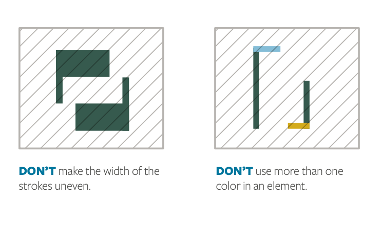
DON'T make the width of the strokes uneven. DON'T use more than one color in an element.
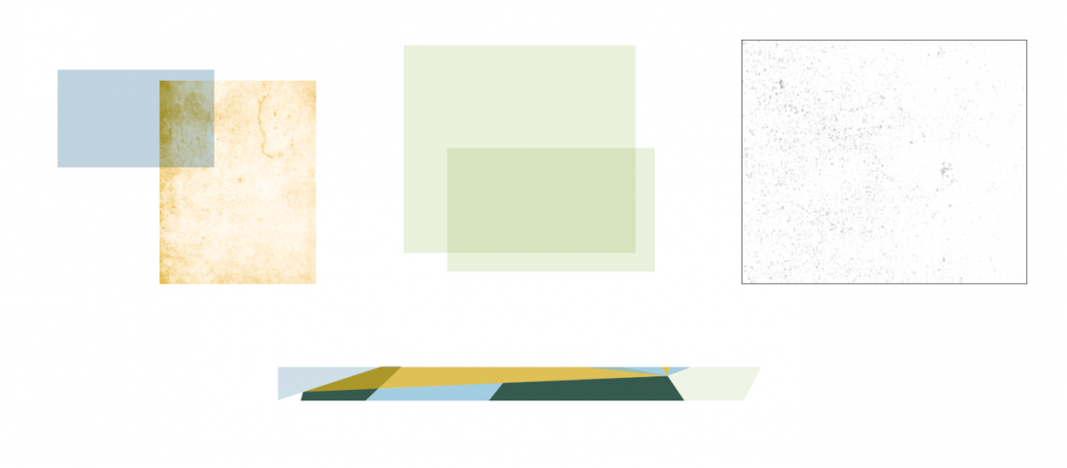
Overlays
Color and texture overlays are a way to frame portraits and candid photography. Play with layering lighter hues and texture to allude to the environment, grit and sweat of New Orleans.

Directions
When using overlays, use Multiply in the effects palette to blend colors together and over imagery. You can also adjust the color of the texture. You can find textures similar to these at stock photo houses like iStock by searching “stone textures”.
Restrictions
Use the elements above as a starting point as an inspiration in your designs, but limit the amount you use per page. Below are two examples of what not to do.
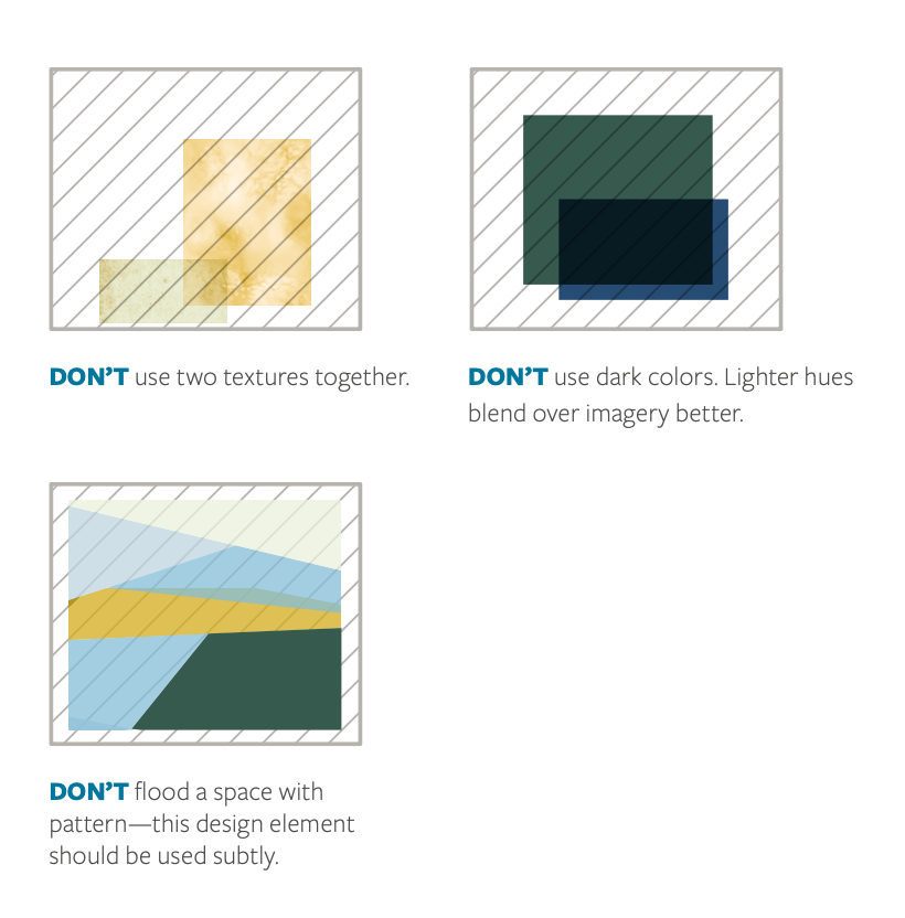
DON'T use two textures together. DON'T use dark colors. Lighter hues blend over imagery better. DON'T flood a space with pattern - this design element should be used subtly.
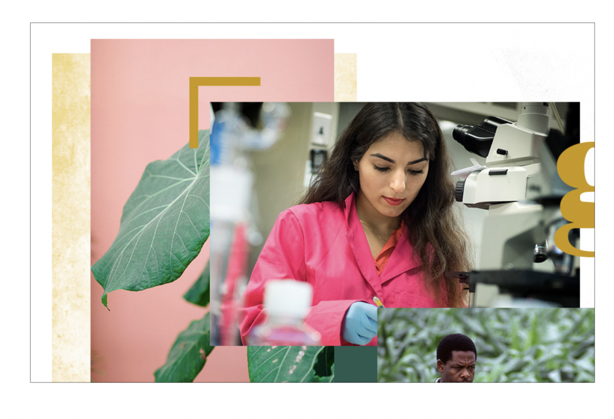
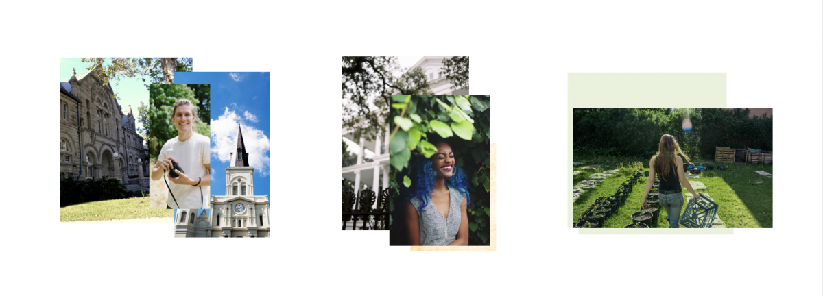
Photo Collage
The layered photo collage is inspired by the energy and culture of New Orleans. With this technique, it’s easy to effectively combine images of heritage and modern life at Tulane.
Directions
When creating photo collages, include a good balance of location, people, and objects while considering color and subject matter in the images. For example, use sense of place photography next to a portrait, or use images that contrast color or tone. Add Multiply in your effects palette to blend the imagery together. flood a space with pattern—this design element should be used subtly.
Restrictions
Use the elements above as a starting point as an inspiration in your designs, but limit the amount you use per page. Below are two examples of what not to do.
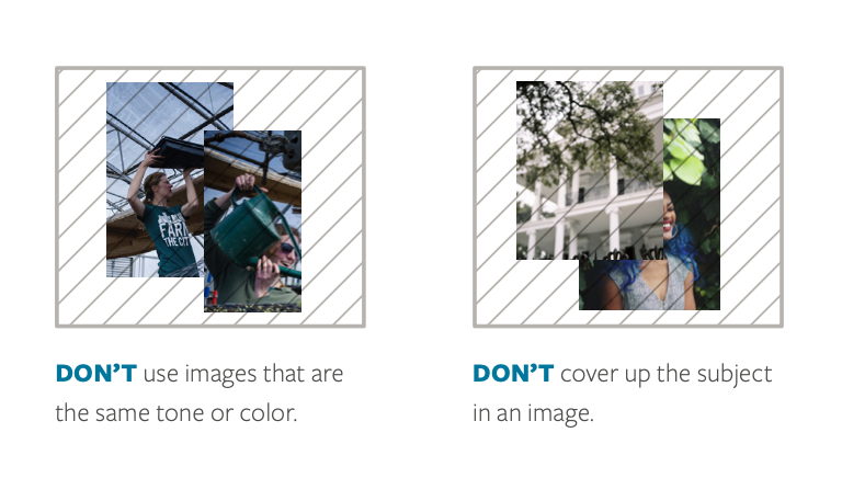
DON'T use images that are the same tone of color. DON'T cover up the subject in an image.
Line Work
Our line work evokes a whimsical feeling inspired by New Orleans architecture and signage.
Directions
Limit the amount you use per page. Stroke should begin at 2pt. stroke, then outlined to keep consistent.
Restrictions
Below is an example of what not to do.
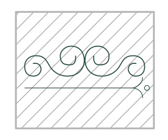
DON’T overlap line-work. DON’T put line work side-by-side.
