
While the Universal Page content type works well for most pages on your site, Article Pages provide greater layout flexibility and additional functionality, especially when designing homepages and landing pages.
Content on Article pages is displayed using a variety of custom blocks. You can view all available custom blocks in our pattern lab.
The process for editing Article pages differs slightly from other content types. We recommend spending some time exploring the various layout and block options to become familiar with the configuration options.
Edit Metadata
Unlike Universal pages, metadata and page content are managed separately for Article pages.
- Click Edit Metadata (this option only appears for Article pages).
- Enter the Page Title. This becomes the value in the <title> tag and appears in the browser tab. In most cases, the title does not display on the page itself.
- Leave the Body, Tags, and Image fields blank.
- To work on the page as a hidden draft, uncheck the Published box at the bottom.
- Under Menu Settings, check Provide a menu link to add the page to your site’s navigation. You can also choose a Parent link if applicable.
- Under URL Alias, URLs are automatically generated by default. Uncheck Generate automatic URL alias if you’d like to create a custom URL (/name-of-page). Custom URLs can help search engines better understand your site’s structure. Example: This page is part of the Drupal Guide’s “Content Types” section: /drupal-guide/content-types/article-page
Edit Page Content
After saving the metadata, click the Edit Content tab to begin adding content.
Content is organized into sections, which act like horizontal containers (think: layers of a cake). You can then add content blocks into these sections.
Sections
In the content area, click + Add Section.

In the "Choose a layout for this section" area, select the column layout you want. "One Column" sections display full-width. "Tailwind One Column Margin" includes left and right white space. Tip: Try different layouts to see which works best for your content.

Under Configure Section:
Administrative Label - Enter a name to help editors identify this section ("Student Testimonial"). This label does not appear on the live page.
Style List – You can typically leave this blank (no choice selected) to use the default theme styles. If needed, adjust spacing using margin and padding options.
Click "Add section" to insert the section onto the page.

Content Blocks
After you add the Section, select and insert a content block. The content block will determine the type, layout and design of your content.
Click + Add block within your newly created section

Click +Create Custom Block at the top of the "Choose a block" menu. You will be selecting from a list of blocks designed for Tulane’s Drupal theme.

Select the desired block type. Each block has its own configuration options.
 Important: Only add one block per section. Use +Add Section for each new block. This makes it easier to manage and reorder your content.
Do not add empty blocks to your page and then click Save. This will break the Article page.
Saving Your Changes
To save the page, to the top of the page and click the green "Save Layout" button. Note that your changes will not display on the published page unless you click the "Save layout" button after updating the content blocks. While changes appear immediately to logged-in users, it may take up to three hours for updates to appear for public visitors.

Editing Existing Content
- Click the Edit Content tab at the top of the page
Scroll down to the block you want to edit and hover your mouse over the pencil icon at the top right of the block. Click the pencil icon and select "Configure" from the dropdown list

- Click the blue Update button after making edits
- To save the page, scroll back to top of page and click the green Save Layout button.
Page Revisions
After the initial page is published, be sure Create New Revision is checked in the top right of the Edit Metadata page every time you make changes. Add a brief Revision Log Message describing your update.
You can view version history under the Revisions tab and revert to previous versions if needed.
Article Page Content Blocks
Accordions work well for breaking up long blocks of text into an expandable/collapsible view.
Accordion Example
Basic blocks have the standard toolbar and can include text, images and template snippets.
Basic Block Example
The Carousel block creates a slideshow of images that users can navigate through using arrows provided.
Content blocks include some combination of an image, header, title, description and call to action link.
There are several "view modes" available -- each view mode provides a slightly different display of the content. Once the content is dropped into the fields, you can switch displays using the View Mode dropdown.
Images:
- Using One Column layout: horizontal, vertical, square images work nicely in vast majority of the Content block views
- Using Tailwind One Column Margined layout: vertical images work better with most Content block views due to the narrow margins
Examples of all view modes:
- Contentblock1*
- Contentblock2
- Contentblock3
- Contentblock4*
- Contentblock7
- Contentblock8
- Contentblock9*
- Contentblock10
*Do not use Tailwind One Column Margined with Contentblock1, Contentblock4 or Contentblock9 view mode
Call to Action blocks allow for a prominent link button with optional descriptive text above it.
CTA Example
Hero blocks allow for a prominent banner/heading across the top of a page.
There are several "view modes" available -- each view mode provides a slightly different display of the content. Once the content is dropped into the fields, you can switch displays using the View Mode dropdown.
Hero images should be at least 1800 pixels wide for best quality. Please compress images before uploading to Drupal.
Hero Video Background Guidelines
Hero background videos can enhance visual storytelling, but should be used thoughtfully to avoid performance and accessibility issues.
- Limit the use of video hero blocks to your homepage or other high-level pages on your site
- Use video when motion adds meaningful context beyond a static image
- Ensure the content aligns with your unit’s goals and messaging
Technical specifications
- Format: .mp4
- Orientation: Horizontal (16:9 aspect ratio)
- Resolution: 720p recommended
- Length: keep videos short, around 10 seconds or less
- File size: Keep as small as possible (ideally under 5–20 MB)
- Audio: Remove audio
- Looping: Video should loop seamlessly (no fade to black)
Performance and optimization
- Compress videos for web delivery to minimize load time. Use “web optimized” export settings when available.
- Provide a fallback image (a still frame from the video) for mobile and slower connections
Design and accessibility
- Keep motion subtle and non-distracting, avoiding quick cuts, jarring transitions, rapid motion, flashing and large sweeping camera movements that may cause discomfort for users with cognitive or vestibular sensitivities.
- Ensure video supports, rather than competes with, page content and readability
Examples of each view mode:
- Hero1
- Hero2
- Hero3
- Hero4
- Hero5
- Hero6
- Hero7
- Hero8
- Hero9
- Hero Narrow Depth - You can add videos to the Hero Narrow Depth block. If you add a video with no background image selected, the video will display. We recommend testing your video to ensure it displays well within the available display area.
- HeroVideo
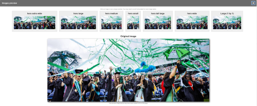
View Modes Using the Focal Point Tool for Image Media:
Several newly added view modes now support the Focal Point module, which allows you to define the most important area of an image for responsive display.
- Hero 2 Extra Wide Responsive Example 1
- Hero 2 Extra Wide Responsive Example 2
- Hero Narrow Extra Wide Responsive Example 1
- Hero Narrow Extra Wide Responsive Example 2
When uploading or editing an Image media item, a crosshair tool will appear over the image. Click on the most important area—such as a face or key object—to set the focal point. This ensures that the selected area remains centered and visible across all responsive crops and layouts throughout the site. Use the “Preview” button (with the magnifying glass icon) to see how the image appears at various responsive sizes. You can adjust the focal point as needed. This feature is also available for existing images.
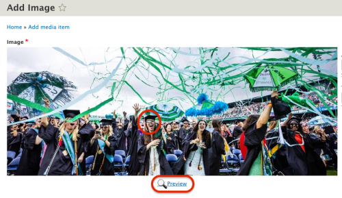
Note: If an uploaded image does not render properly after saving, edit the image again and click the Preview button to trigger the responsive view modes to render correctly. And after previewing the image, click 'Save' once more for good measure.
Image & Text blocks contain side by side image and text with optional small and main titles above them.
There are two "view modes" available -- each displays the content the same way but one has a dark green background and the other has a light blue background. Once the content is dropped into the fields, you can switch displays using the View Mode dropdown.
Examples of both view modes:
Image Content Grid blocks display photos in rows of 2, 3 or 4. Each photo in the grid can be hyperlinked (but it's not required). If you include an image description, it will appear below the photo.
Examples of all view modes:
The Masonry Grid block is a photo grid layout that does not have a fixed row height and places images based on available vertical space. This grid layout works best with a minimum of 12 photos.
Photogrid blocks display photos in rows of 3. Each photo in the grid can be hyperlinked (but it's not required). If you include an image description, it will appear in a green overlay when you hover over the photo.
Pulled Quote blocks display text on the page as an attention-grabbing visual element.
There is no need to include quotation marks in the Quote field or a dash in the Attribution field.
Quick Links blocks create a prominent grid of button links with a gold textured background.
Quick Links Example
Quote Images blocks display quotation text in white over an image. The quotation/attribution text can float either to the right or left.
A Social Media Icons Block allows you to add a row of departmental or school social icons to an Article page
The Standalone Image block allows you to upload a single image on the page.
If you'd like an image to run full width across the page, the compressed image must be at least 2000 pixels wide.
Standalone text blocks provide four ways to display short blocks of text.
There are four "view modes" available -- each view mode provides a slightly different display of the content. Once the content is dropped into the fields, you can switch displays using the View Mode dropdown.
Examples of all view modes:
Statistics blocks allow numerical data to be displayed in a visually appealing way.
There are several "view modes" available -- each view mode provides a slightly different display of the content. Once the content is dropped into the fields, you can switch displays using the View Mode dropdown.
Examples of all view modes:
The Youtube video block allows you to embed a video on the page. Use One Column for a full-width video. Use Tailwind One Column Margined for a video with margins.
All available custom blocks can also be viewed in our pattern lab.