When used thoughtfully, typography becomes a powerful brand tool that can add visual meaning to what is communicated. Tulane’s typography communicates clearly and cleanly, and is flexible for a wide range of situations. If you need access to Tulane brand fonts, please contact creative@tulane.edu.
Print Fonts

Caslon
Caslon is our primary typeface, suitable for both body text and large text such as headings. It is a transitional serif, used regularly in publications for its legibility, that carries an air of modern sophistication, similar to the Tulane brand. In use, it is best to use the Regular weight. However, due to Caslon’s variation in thick and thin strokes, when reducing type below 8 pt., you must use a heavier weight like Semibold or Bold to increase legibility.
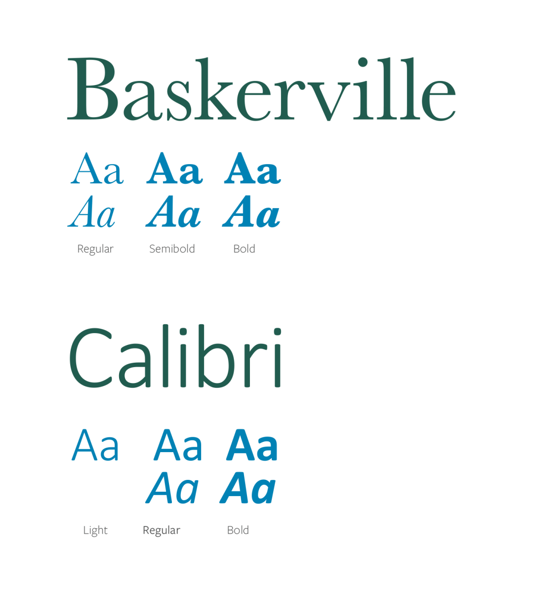
If Caslon is unavailable to you, or you need a web-safe alternative, Baskerville may be substituted.


Freight Sans Pro
Freight Sans Pro is our secondary typeface and is used almost exclusively for callouts and captions. Its humanist forms give it a warm and friendly appearance. When you look through our sample layouts of Freight Sans in use, you will notice it is primarily set in all caps for callouts but can be used lowercase in limited instances. All of the weights are available to you; however, when setting smaller callouts, it is best to use a heavier weight like Bold.
If Freight Sans is unavailable to you, or you need a web-safe alternative, Geneva may be substituted.

Desktop Fonts
Web Fonts